CLIENT
Shagala Bagala
SERVICES
Logo Design
Branding
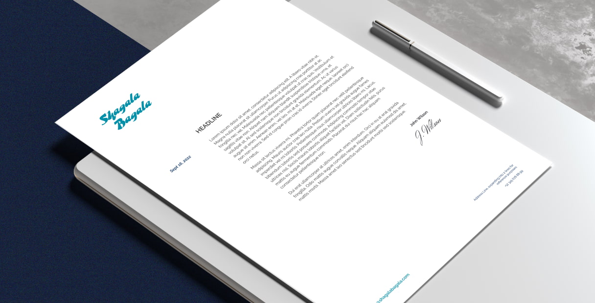
Print Design
PROJECT OVERVIEW
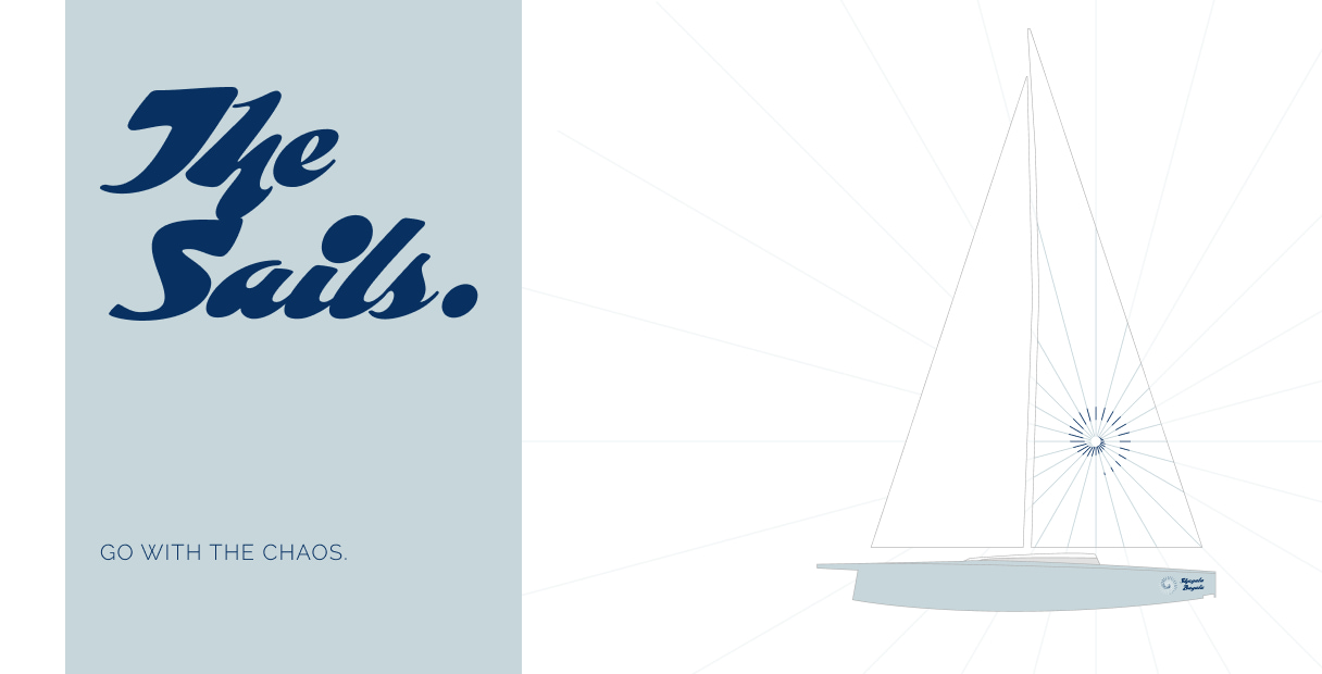
We came together with the Shagala Bagala team to design their yacht’s branding and brand assets. It is a sailing yacht, taking its name from Swahili language, meaning creative chaos. We worked on translating the brand characteristics into the branding in this project.
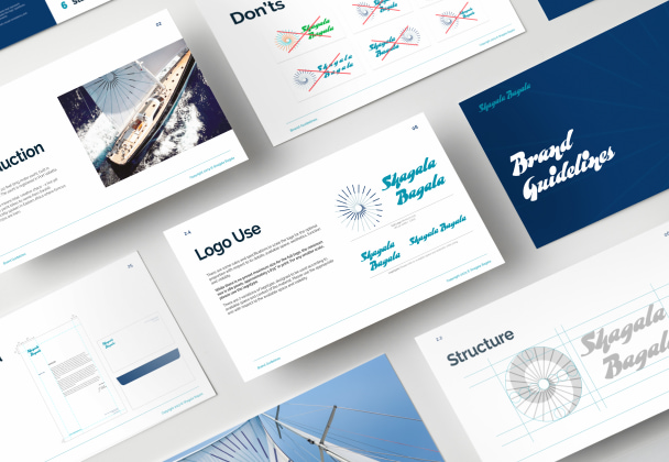
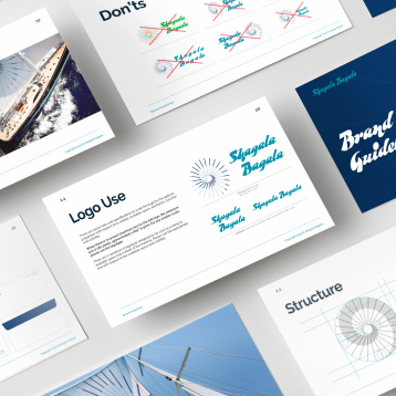
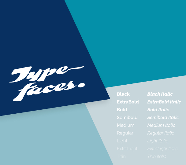
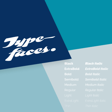
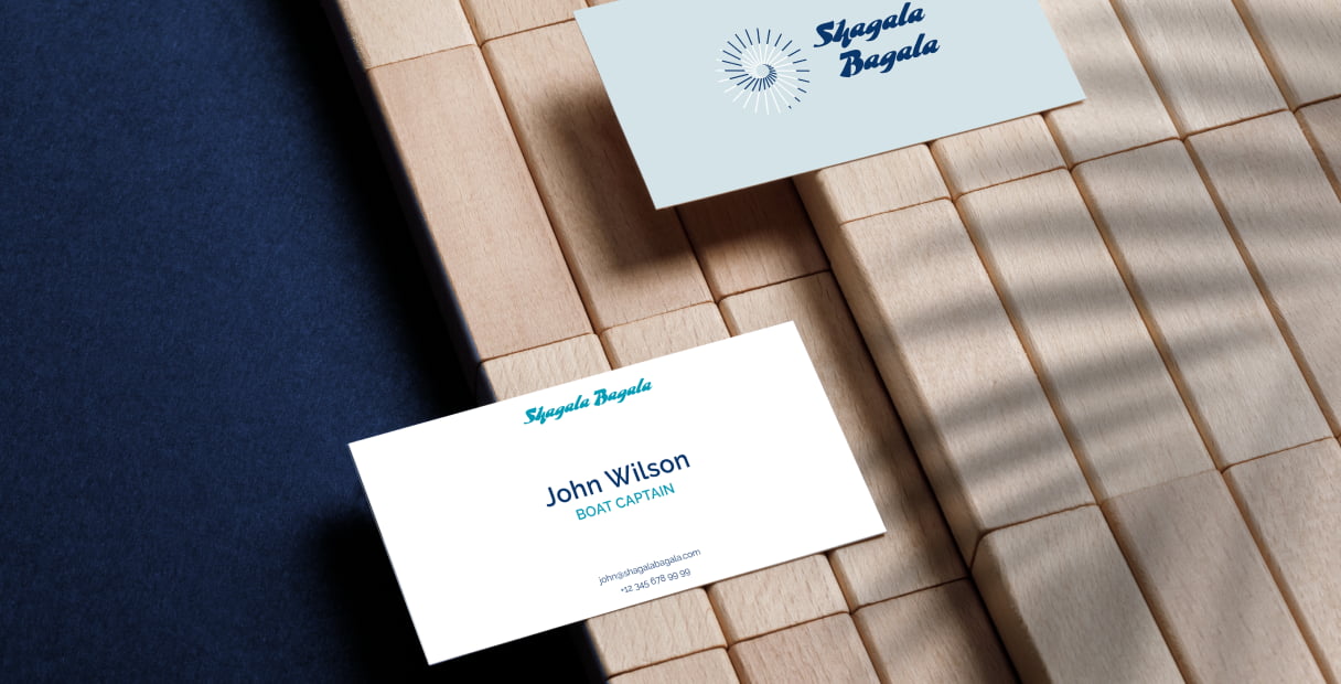
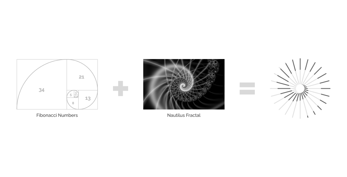
Ordered in a Chaotic Way: A Digital and Print Optimized Logo Design
The logo’s inspiration comes from ordered chaos, and the underlying elements are taken from both mathematical and natural forms. The nautilus shape and growing fractal structure within the logo creates a continuous spiral that reflects a growing and endless being, as well as geometric fashioned sun rays which capture the energetic and geometric-dense cultural engravings of the Swahili culture. Overall, the logo is designed to present the apparent disorder that follows a noticeable pattern, reflecting the dynamic character of the brand.
A Balanced Combination of Dynamism and Versatility for the Branding
Our main goal was to strike a balance between chaotic yet sleek stance while working on branding. To achieve this balance genuinely, we worked to find complementing font and color combinations. The logotype is chosen to express the dynamic attitude through contrasting brush strokes, while the complementing typeface is selected to reflect minimalist and versatile characteristics through its neo-grotesque style and subtle twirls. The brand’s color palette is based on 2 strongly contrasting main colors and their midtones: vibrant turquoise and deep navy blues. Discussing with the project stakeholders throughout the branding process, we created a dynamic effect with the aqua’s brightness and energetic attitude and navy blue’s depth and sophisticated elements.
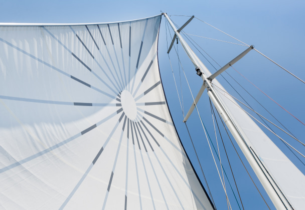
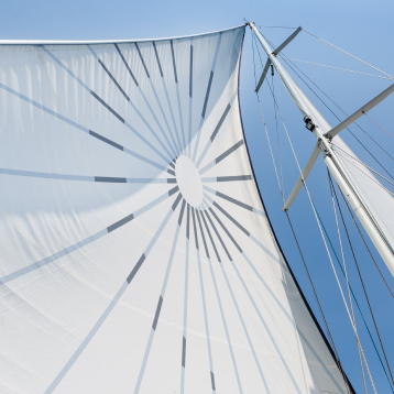
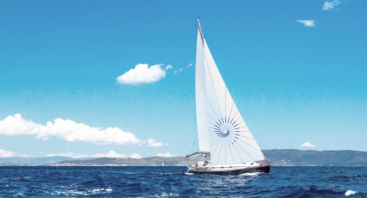
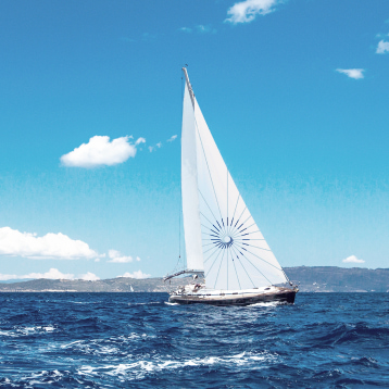
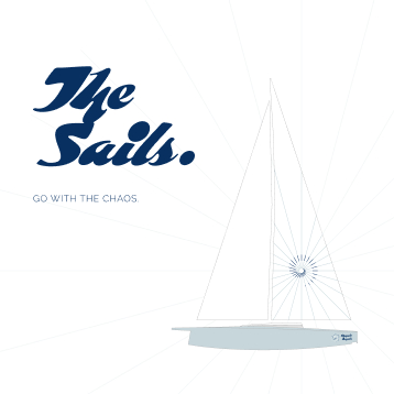
Seen on the water: Sail Designs for the Yacht
Following the logo and branding design, we moved forward with print designs for the sails. We have adjusted the logo pattern and collaboratively decided on its placement for the sail scale. While working on sail print designs, our objective was to achieve a bold and dynamic pattern that catches the eye and evoke a sense of adventure in the sea. We have created the sail design in line with the sail print requirements, sizes and real-life use cases including but not limited to its look on the wind and patch needs.
See a bit more of what we did...
Case studies from our selected works.
Let's talk.